UX According to Nick Knowles
—Yes, you read that correctly; Nick Knowles. The themes behind the BBC One series DIY SOS and Channel 5's Big House Clearout bear close resemblance to how you might approach a website that's no longer working for you, but simply 'moving around the furniture' is unlikely to make the tangible impact you're looking for.
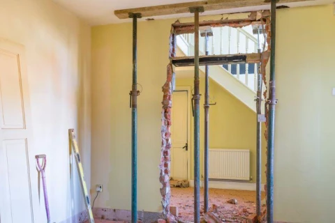
In DIY SOS Nick Knowles meets families whose houses don’t work for them. There is usually a traumatic story explaining why and their houses need big changes. Builders, joiners, designers, plumbers, carpenters, decorators are all bought in to make dramatic wholesale changes to their homes. Walls are knocked down, rooms are changed, floors are added. The house is often unrecognisable afterwards. Families are left with essentially a brand new home designed to help solve their housing difficulties.
I think we’d all like Nick Knowles to arrive at our house telling us he can radically improve our homes in 5 days.
The disappointing truth is that this probably isn’t going to happen.
Which is where another piece of Nick Knowles TV gold comes in. “Big House Clear Out.” I’ll be honest, I’ve never watched a full episode of either of these shows but it seems that what happens in this show is that once again, Nick Knowles arrives at someone's home. Once again the house isn’t working very well for them and once again Nick Knowles dons his superman cape and offers to help. The difference with "Big House Clear Out" is that the budget is far smaller. Nick doesn’t have the same band of builders, joiners, designers, plumbers, carpenters and decorators. However his team seeks to bring big improvements to the house.
This time though there are no walls being knocked down. No additional rooms being built, no cement mixers in sight. Instead they have a big old sort out. They remove the contents of peoples houses, find a big warehouse and sort through the clutter. They look at everything they have and find a new, better, clearer way to order the homeowners "stuff". They may build a few shelves and cupboards and add a new lick of paint, but not much more than that. The results are still significant though. The same building suddenly has order, purpose and clarity.
When it comes to our websites and digital offerings we might like the idea of the brand new DIY SOS style site. The new build. The new design. The new ideas. Maybe though, this isn’t a feasible option for you at the moment.
The temptation with existing sites can be to just keep adding more content, or maybe to move around the content that is already there in the hope that something successful is stumbled on. This rarely solves much. It amounts to little more than moving around the furniture.
So what would the “Big House Clear Out” version of your website look like? What could your existing site look like if some time was taken to step back, look at the data, read the analytics, view the heat maps and make some informed changes?
How could your site be organised and designed to better fulfil its purpose? Yes it might not be the DIY SOS site, but it can most certainly be far more than what it is right now.
We can’t promise that Nick Knowles will be on the other end of the phone if you call A Digital, but we do have the digital agency equivalents. If your website is feeling surrounded by clutter or is perhaps in need of the full SOS treatment, then let us mobilise our team and put a plan in place to bring order and clarity that can extend well beyond just your website.
I need help with our website!
