
We need to talk about passwords
—Before we start, don’t worry, I’m not here to tell you off about your weak passwords. Although if your password is one of these, go change it now. No, right now. Come back to me when you’re done.
What I want to discuss, is the user experience of creating passwords, and in particular, the user experience of resetting a password. Let me tell you an anecdote.
A real user’s experience
Last weekend, I sat beside my partner as she got more and more frustrated while trying to log in to a website. My partner is the same age as me, and although she doesn’t design and build websites, she does work with some pretty complex technology, so she’s not a Luddite.
She was trying to submit some meter readings (very grown-up, I know), so giving up and going elsewhere wasn’t an option. With an online shopping experience, any friction in the user experience will result in you losing customers. This unfortunately wasn’t an option.
Unable to log in, she did what we all do and went through her usual passwords, then her variations on these passwords. No joy. So a password reset was required. Upon which she was greeted with this long list of criteria that the password needed to meet.
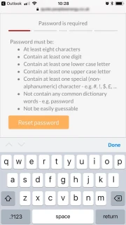
7 rules for (re)setting your password
- At least eight characters
- Contain at least one digit
- Contain at least one lower case letter
- Contain at least one upper case letter
- Contain at least one special (non-alphanumeric) character - e.g. #, !, $, £, …
- Not contain any common dictionary words - e.g. password
- Not be easily guessable
Suddenly it was very clear why she couldn’t remember, or even guess at her password.
After typing in her new password (on a mobile), she must have made a small typo from what she thought she had entered, and because there was no “Confirm Password” input field, she didn’t know this until she tried to log in again. Which meant resetting the password… again.
After 5 or so very frustrating minutes, she eventually got logged in. I have a feeling that lots of other people would have given up and called the company instead - poor use of time for both the customer and the company in question.
I would like to say that this anecdote is unusual but I know from my own experience that it is not. I’ve even experienced websites with far stricter rules; rules likes not repeating patterns of characters or even using the same character twice.
The Pain Points
This experience failed at several points and in ways that are frustratingly easy to fix:
- There was no hint of the password rules until at the point of resetting the password
- The passwords rules are prohibitively strict
- With no “Confirm Password” field, there was no way to check the password entered
- The “Password” field didn’t have an option to toggle from password to plain text
As a website designer, I realise more than most how easily these issues can be resolved. So let’s look at each pain point in more detail:
Pain 1 - No hint of password rules
This was probably the biggest gripe of the whole experience. Having a reminder of the password rules at the point of login, while not normal, is probably a good idea if you are going to make your login rules so strict.
I appreciate why you would not want to have the rules up-front for security reasons, as a means of preventing brute force attacks (trial and error of guessing a login). However, this logic quickly falls away when you realise that you already present the login rules to the public (non-logged in users) anyway when they create an account.
Even if you don’t want to show the rules on the initial login screen, if the user fails to login, why not include the rules as a reminder in the error messages?
Sorry, that password doesn’t match the username. Just a reminder, your password should contain…
This would help people remember what they might have used, if their normal password doesn’t meet your criteria.
Pain 2 - Prohibitively strict rules
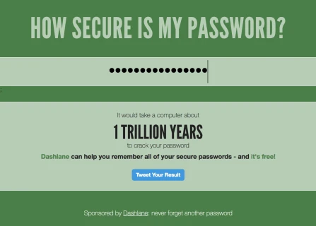
I would like to think that most people nowadays aim to have at least relatively secure passwords - trying to strike the balance between passwords that are hard to crack and ones that they will remember.
According to How Secure Is My Password? one of my most secure passwords would take a computer 1 trillion years to crack. So, pretty sure. However, it would not pass the rules set by the website in question - although I’m not going to tell you which rule it fails on ;)
Need help with your digital strategy?
Get in touch — we'd love to hear about your project.
My secure password is not secure enough
Pain 3 - No Confirm Password field
This one is pretty basic. When setting a password, most websites will make you enter it twice, and for good reason. Password fields use an asterisk or dot to indicate the number of characters you have entered, with the basic security of obscuring your password from anyone who may be watching over your shoulder.
When setting your password, you can’t visually check that you have correctly entered your new password, so being asked to confirm what you have entered is a great sanity check. If the two fields match, there is a pretty good chance that the password entered is what you intended.
If you are not going to offer a “Confirm Password” field, you should at the very least offer a way to visually check the password…
Pain 4 - No option to toggle to plain text
You have probably already seen this relatively new web pattern. It is quite common on mobile apps, and is becoming more popular on websites too, especially those with high mobile traffic. Very simply, the password field has an option, usually an icon, that allows users to toggle back and forth between password (asterisk or dots) and plain text view. By giving the user this option, it means they can visually check the password before submitting it. This functionality comes in handy for both password reset and login forms. It removes one of those layers of friction that we spoke about earlier.
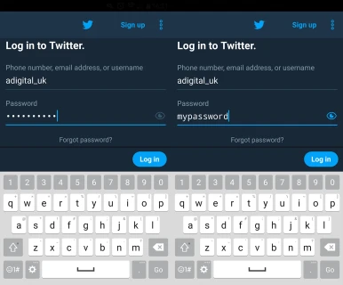
Toggle view on password field, Twitter app on Android
Conclusion
The experience my partner had with logging in to submit meter readings is made all the more frustrating, knowing that a few simple steps would have greatly improved the user experience. But what her experience with the login and password reset forms suggests, is that the website owners are more concerned with security, even to the detriment of their users. I’m all for security, but when a few simple steps would make life easier for your users, without sacrificing security, why wouldn’t you take these steps?
The developers of this website are essentially encouraging people to use randomly generated passwords, which in itself is not a problem. But members of the general public don’t, or should I say won’t, keep a record of complex/unrememberable passwords. And why should they?
The problem with complex, generated passwords is that they need to be stored somewhere. The nature of them makes them hard to remember, especially if you are not entering them on a daily basis. And if you are storing a password (or multiple passwords) somewhere, you need to do so securely, i.e. in another “locked down” location behind a login - a login which should be even more complex since it holds the ‘keys to the kingdom’ or all the user’s passwords. And suddenly we have introduced another layer of friction into the signing in process…
Final Thoughts
While I can’t say that we at A Digital haven’t also made these mistakes, what I can say is that by watching someone else come up against hurdles using a website, I have learnt a lot of valuable lessons to bring forward into our new projects - lessons that I felt were important enough to share here with you. I hope you find these insights useful in your upcoming website projects.