Essential Tools For Planning Your Website: Part 5 - Style Tiles
—Welcome to the fifth and final part of the Essential Tools For Planning Your Website series. We hope you've enjoyed it and taken some useful tips from it.
This week we'll look at style tiles, having previously explored personas, the customer journey, the sitemap, and wireframes. You'll need these handy for reference when making your style tiles. So if you haven't read parts 1 - 4, we suggest looking back through these previous posts.
Style Tiles
Styles tiles are a great way for you to think about colour, pattern, fonts, icons and even photography in your website’s design. And all without actually getting into the nitty-gritty of the final design. The styletil.es website gives a great overview on styles tiles and describes style tiles as:
“…a design deliverable consisting of fonts, colors and interface elements that communicate the essence of a visual brand for the web.”
styletil.es
If you have brand guidelines, you are already well on your way to creating style tiles for your website. If not, it’s time to find your inner designer and get stuck in.
Need help with your digital strategy?
Get in touch — we'd love to hear about your project.
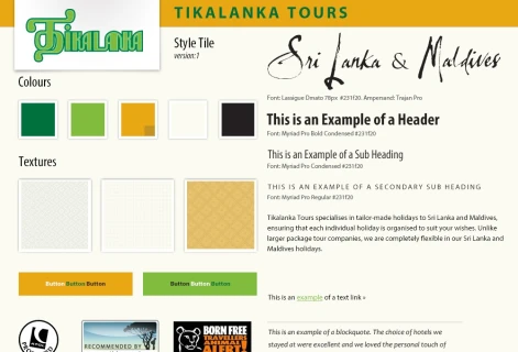
A section of the style tile created for Tikalanka Tours
Creating Style Tiles
Colour
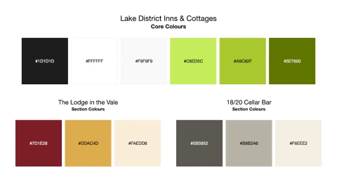
The colour palettes created for Lake District Inns & Cottages
If you have brand guidelines then you already have a palette of colours to work with. Depending on how strict your brand guidelines are you may also be able to consider some variations on these colours, usually referred to as tints.
If not, don’t worry. There are lots of great online tools that will help you become a colour picking pro in no time!
- Understand the basics of colour theory - https://www.colormatters.com/color-and-design/basic-color-theory
- Deeper understanding of colour theory - http://www.creativebloq.com/colour/colour-theory-11121290/2
- Colour palette inspiration and mixing tools:
- Simple way to tweak a colour palette you’ve found - http://javier.xyz/cohesive-colors/
Fonts
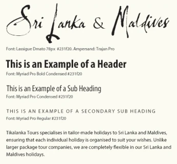
The font selection for Tikalanka Tours based on their branding guidelines
Existing brand guidelines will likely dictate your choice of fonts. Less detailed guidelines may mean that you have more freedom over which fonts to use. But this means you will need to understand the basics of typography.
When picking your main ‘body’ font – the one that most of the content will appear in – start by choosing one that is easy to read. Choose one that comes in a variety weights and styles – normal, bold and italic at the very least. Ensure the font has a full character set as you’ll need more than A-Z and 0-9. It is a good idea to pick one that was designed to read well on screens too.
You may have a bit more flexibility when it comes to ‘display’ fonts used for headings. But you will still need to ‘pair’ the fonts. Do they look good and work together? Do they have the same character?
You should generally stick to the tried and tested fonts that have stood the test of time. Free fonts aren’t likely to offer everything you need, and very likely don’t come in web-friendly / hosted versions. We recommend the following sites for font selection, and they also host the fonts too:
Finally, limit your choice to 2-3 fonts. Although many well-designed font families offer enough variety to use on their own.
Patterns
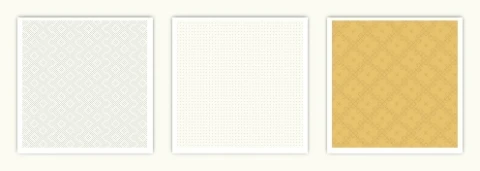
Patterns and textures from the Tikalanka Tours style tile
You may or may not want patterns in your design. Depending on your brand, they may or may not suit. Patterns can be big, bold and brash, or they can be subtle and add little more than texture to your website. Depending on what you are trying to achieve, patterns can be a real asset to your design.
- https://www.toptal.com/designers/subtlepatterns/
- https://www.transparenttextures.com/
- http://www.free-patterns.info/
Icons
Icons are a great way to convey meaning without words or supporting words. Lots of icons have become standardised across websites so users are already familiar with their meaning.
There are lots of great quality free icon libraries available online and many of them are available as fonts. Your web developers will love this because they are easy to add to websites and are retina display ready.
A selection of icons to use on the Lake District Inns & Cottages website
Photography
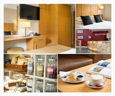
Exploring photography and image layout
Great photography can lift your website above the crowd. You may not have a library of images or your library may need updating. Now is a good time to start thinking about the style you’d like for your website. The photos should tie in with your theme. They could be products (in detail and in use), people, lifestyle, fashion or a combination.
While not recommended for your final images, stock websites are a very good place to start. You can quickly explore lots of different styles. Don’t get too hung-up if the content matter isn’t quite right for now. You should take or commission your own images for the live site anyway.
- http://www.pikwizard.com
- http://finda.photo/
- http://www.freepik.com/
- https://www.pexels.com/
- https://unsplash.com/
- https://pixabay.com/
What You’ll Need
- All of your planning materials for reference
- Your chosen design assets - colour palette, font families, patterns, icons and photography
- Photoshop or similar, to create your style tile
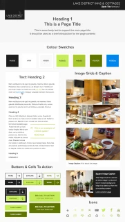
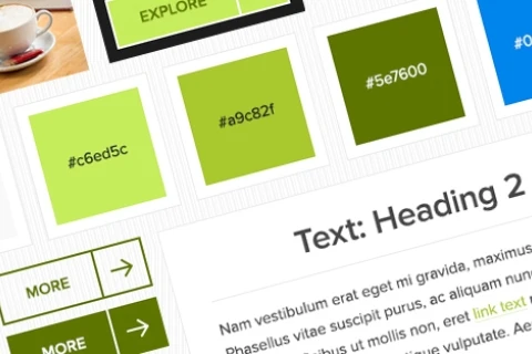
The full detailed style tile created for Lake District Inns & Cottages
Final Thoughts
Well done! You made it to the end of this 5 part series on Essential Tools For Planning Your Website. You should now have a strong base to design and develop your website upon. By ironing out all the details now, you are ensuring a smoother website build.
At A Digital, we follow these steps on all our website projects. We find that it helps everyone, both us and the client, understand who and what the website is for. Only once we understand what a website is aiming to achieve do we start to design and development a website. This process works for us and we hope you've found it useful too.
If you're at the stage of thinking about your own website build, why not get in touch for a chap?Many of our projects have started from a standalone discovery session, where we advise and guide you, based on what you've already got, and what you're looking to achieve.